


Auspice
The Auspice dashboard integrated into Cohesive allows you to view phylogenetic trees, associated metadata, and geographic data produced by Augur.
Access to the Auspice integrated dashboard is available in all execution cards of Augur analyses that finished execution successfully (see the "Check analysis" section).
Quick guide
The following video provides a quick guide to Auspice's interface, with demonstration of menu options, map and graph features.
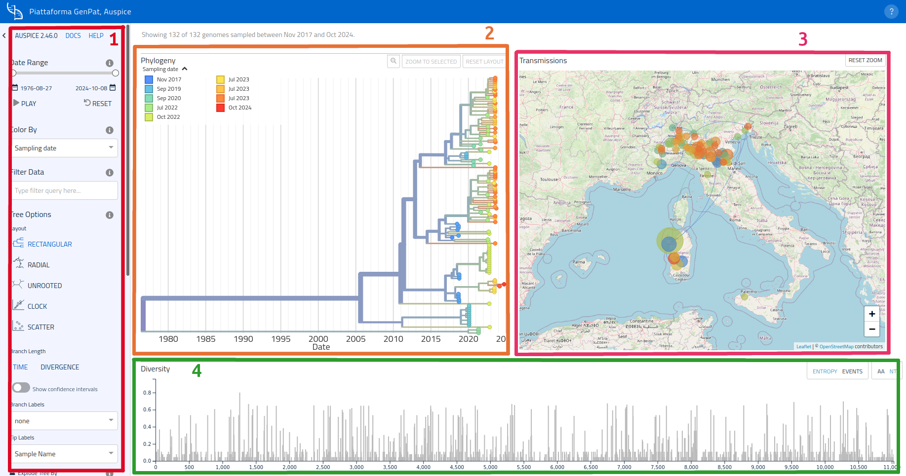
Main user interface
Auspice's user interface is composed of 5 main areas:
- an options side bar on the left side (1);
- the phylogenetic tree on the left (2);
- a map on the right side, where clusters can be displayed thanks to geographic data (3);
- the diversity graph (which can be toggled to display entropy/events), below the map and phylogenetic tree (4);
- a filters area, just below the graph (5).
Options bar
The options bar (or menu) links to Auspice's official manual pages and docs and groups various options in categories, in order to manage different aspects of how data is displayed:
- Visualization, colors and data filter;
- Tree options;
- Map options;
- Animation options;
- Layout and panels.
The menu is thoroughly described in Auspice's official guide, furthermore each element of the menu has an associated info button ( ), which displays a description of the respective option when hovering the mouse pointer above it.
Usage of the options bar is demonstrated in the introductory video.
In this manual page you will find some of the most important features of each dashboard element. For in-depth guides descriptions please consult Auspice's official guide.
Phylogenetic tree
Layout
The phylogenetic tree can be displayed as a side panel on the left (default) or over the entire width of the page ("FULL" layout mode, enabled thanks to the Panel Options of the side bar).
The side bar options also allow to choose from 5 different layouts for the phylogenetic tree.
Tree branch options are available in the side bar too, and include toggles to:
- switch between representation of sample distances as time distance scale and divergence scale;
- show or hide confidence intervals and branch labels;
- select displayed information in the leaf labels;
- display the tree as a break-out chart based on the associated metadata.
Legend
The legend (in the top-right corner) can be displayed or hidden by clicking on the arrow button ( ); furthermore, tree leaves are highlighted when hovering the mouse over the legend elements.
Zoom and focused samples
Hovering the mouse over samples in the tree will show a summary of the sample's related information, while clicking on one of them will focus on that area and display the full information sheet of the selected sample.
Zoom options are managed using the 3 buttons in the top dash:  .
.
When clicking on a sample in the graph, the selected sample will be added to a filter used for data visualization (the full list of samples in the filter is displayed above the graph):
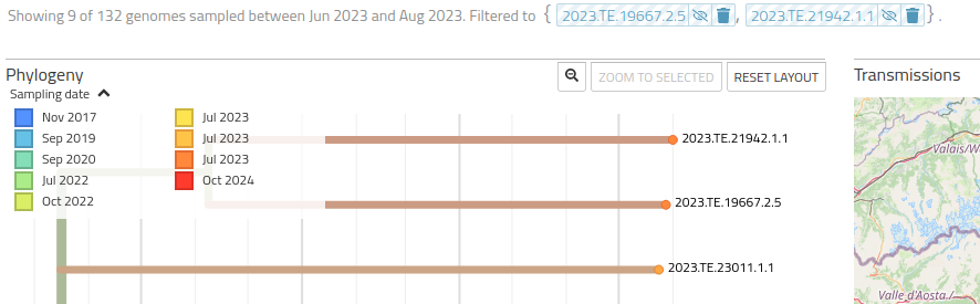
This interaction empowers users with the ability to hide or show samples selectively, as well as to remove single samples from the filter. Samples can also be removed in bulk from the filter using options in the Data Filter section of the side bar, which allow to activate/deactivate visualization of selected samples or to remove the filter altogether.
Map
To navigate the map:
- Use the mouse wheel while holding the
Ctrlkey to adjust zoom; - Zoom can be also adjusted using the +/- buttons in the lower-right corner of the map. Double click on the map is equivalent to pressing the + button;
- Hold the
Shiftkey (orMaiusckey, depending on keyboard layout) while creating a selection area with the mouse (hold the left mouse button and drag) to zoom in the selected area; - Use the button in the upper-left corner of the map to reset the zoom.
Map and graph are tied to each other: node selection from the graph will also highlight the position on the map.
Options for the map available in the side bar include adjustment of geographical resolution (depending on level of accuracy of geographic data) and hide/show toggle of transmission lines.
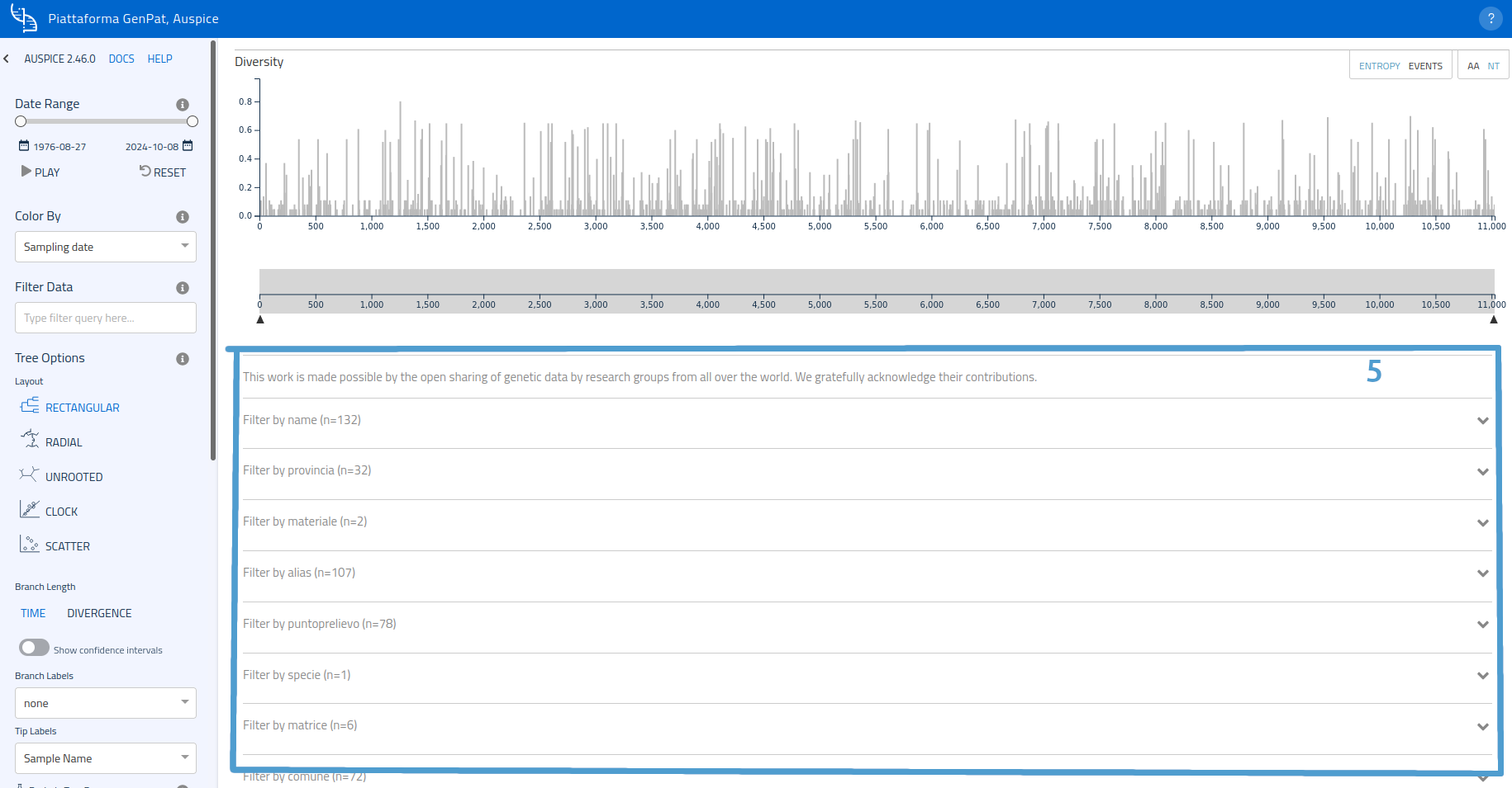
Diversity chart
A third graph, the "Diversity graph", located below the map and phylogenetic tree, displays sample diversity based on nucleotides or amino acids (the latter is not available in the platform's integration). The chart can show either the "Entropy" page or the "Events" page (the toggle is in the upper-right corner) and also provides zoom adjustment through selection of a range in the graduated line at the bottom.
Filers
Available filters (one for each metadata category) are listed further down. Filter types can be selected by clicking on the corresponding card to expand it.

Example: to filter samples based on sampling point, open the card of "sampling point" metadata and select the desired location.
Animation
Samples can be shown on the map and graph through an animation which them displays consecutively, starting from those closer to the tree's root. Available options in the option bar include animation speed, activation of loop mode and cumulative mode (the latter keeps showing the nodes on the map after they first appear, rather than showing them just transiently).
